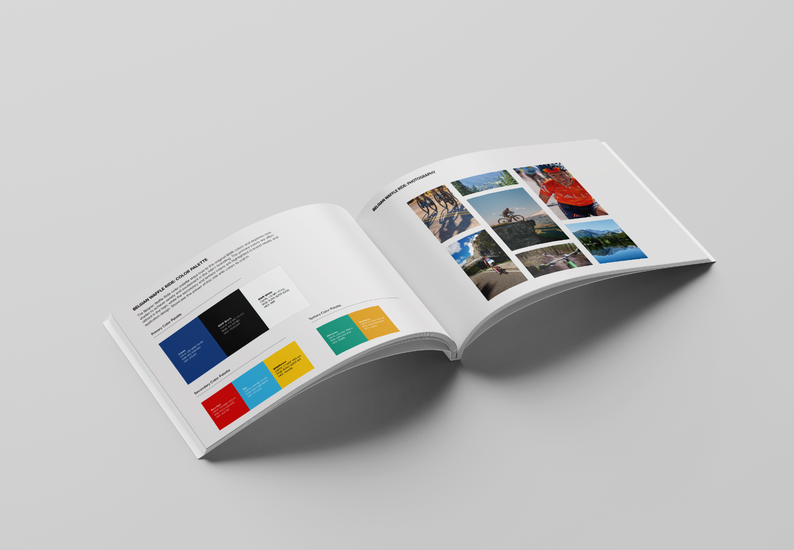
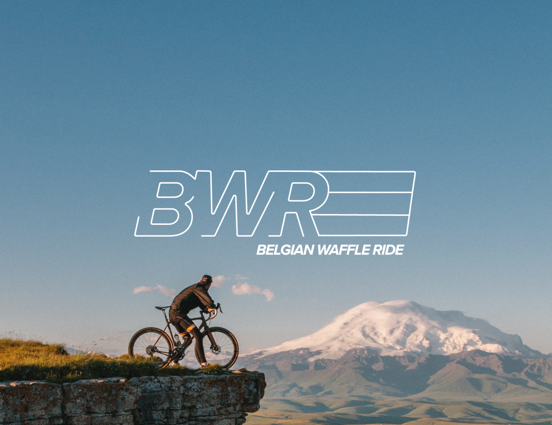
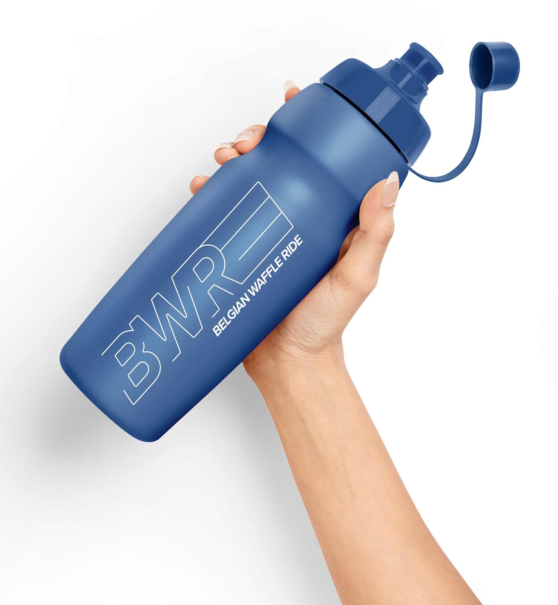
The Belgian Waffle Ride is positioned as the most unique one-day cycling event in the country, celebrating its Belgian heritage with a pre-ride waffle breakfast and engaging experiences for both new and veteran riders. The redesigned BWR logo features dynamic lines, broken letterforms, and italic typography to evoke speed, movement, and bike trails. The minimalist BWR letters are layered over the Belgian flag, while the bold color palette blends the original BWR colors with fresh shades to inject variety and excitement into the brand. Proxima Nova was chosen as the font family for its bold, clear, and strong presence.
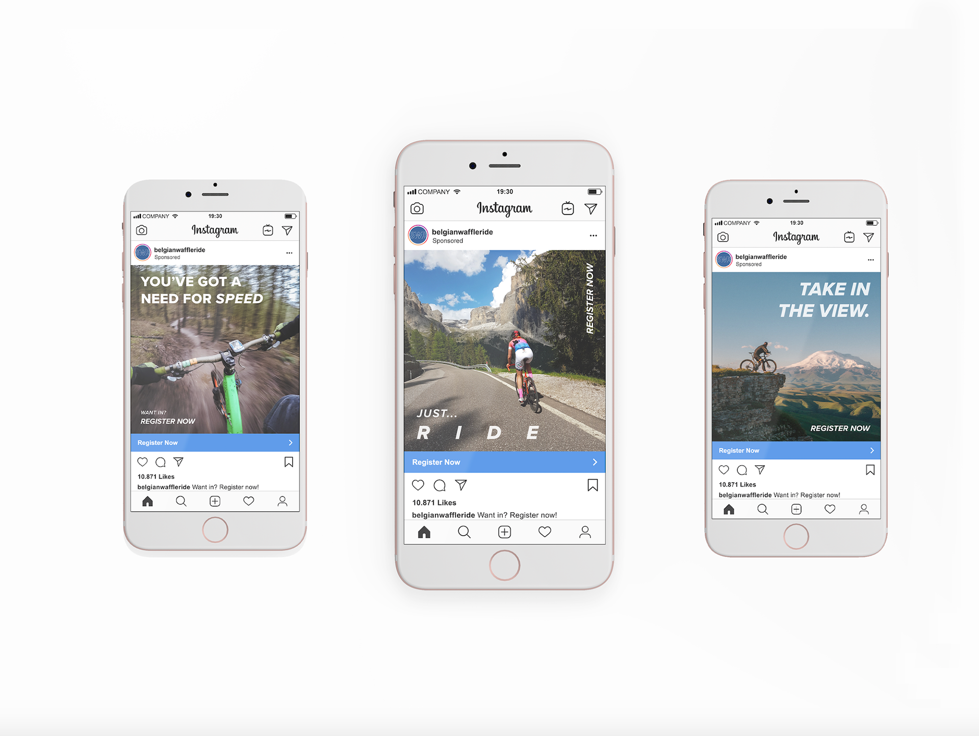
Photography-driven advertisements target distinct audiences identified through research, aiming to both reignite the enthusiasm of returning riders and attract newcomers eager to experience the event.