
Little Spoon, a new cereal-themed dessert food truck, features branding that’s colorful, playful, and bold. The primary logo uses custom letterforms arranged to create a hand-crafted, whimsical feel. Complementing the typographic logo, an illustrated character inspired by 1950s design adds a nostalgic touch. The bright, feminine color palette draws attention and reflects the brand’s fun, nostalgic energy—evoking the vibrant colors of classic cereals to attract its target audience.
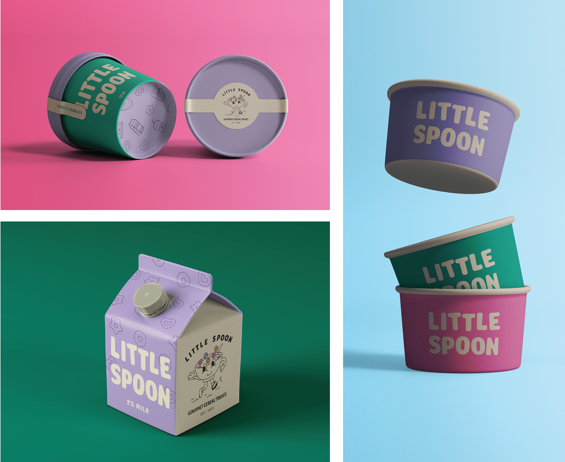
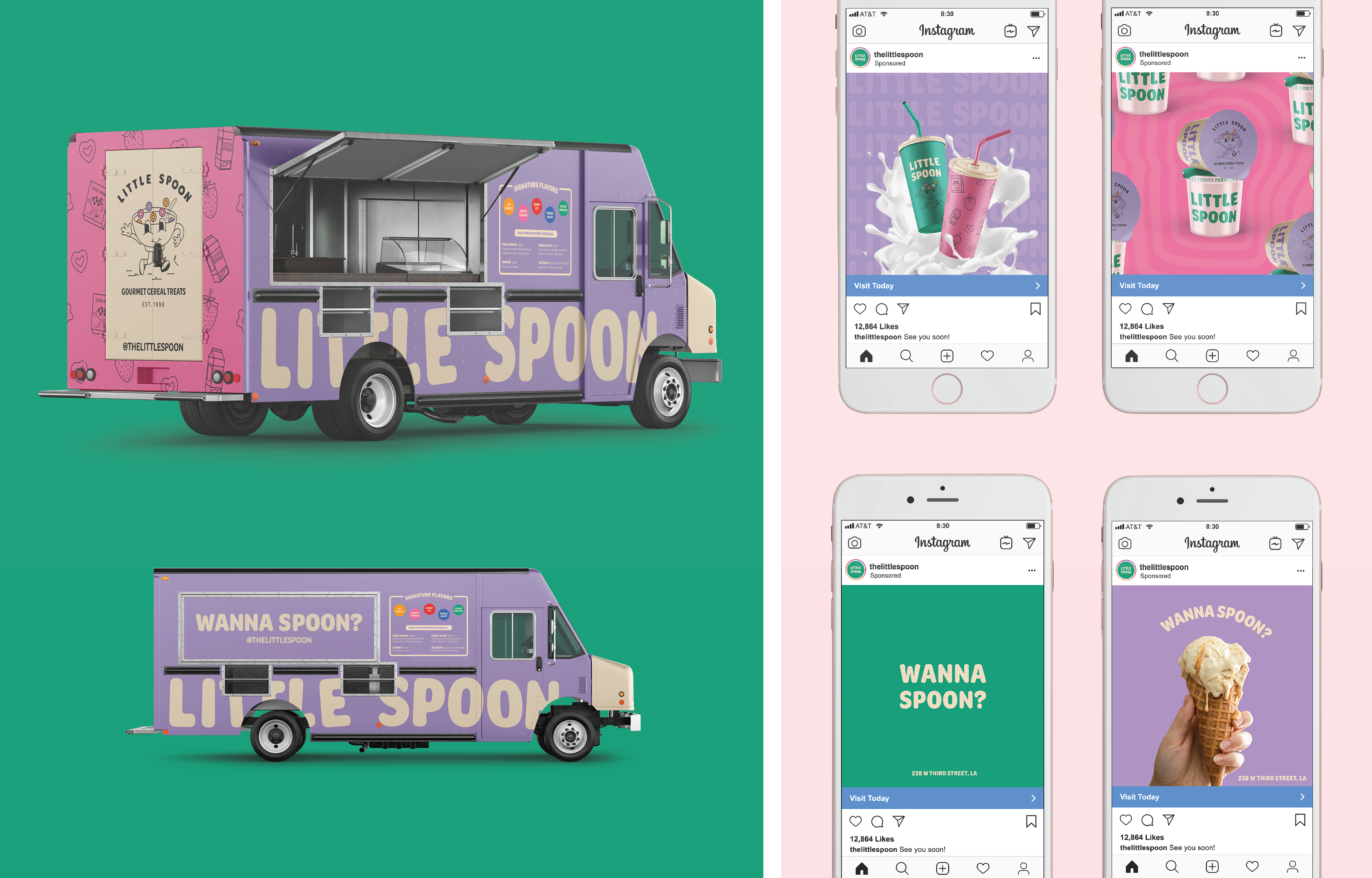
Little Spoon’s packaging is designed to excite customers and encourage them to share photos of their treats. The colorful food truck reflects the brand’s playful identity, featuring Spoonie and the signature pattern on the back to create a perfect photo backdrop for customers. The menu is displayed prominently as printed signage on the truck. Retention advertisements focus on striking imagery that fits seamlessly into the brand’s social media feed, while acquisition ads use the catchy phrase 'Wanna Spoon?' to engage viewers and spark curiosity.
